
I made it through my month in Canada and had a splendid time. Things have been interesting since returning home and I find myself trying to figure out the exact direction I want to move in and how to get there. Things are blurry, but hopefully will become clear soon and I’ll have more to share with you about my experience. For now, I wanted to share this interview I had the opportunity to do with a self-publishing YA author. I found Becca Campbell’s book through Goodreads, where I signed up to read an Advanced Reader Copy. It was the first time I’ve participated in an ARC reading and it was quite enjoyable, though the timing was derailed due to everything going on. Here’s an introduction to the book:
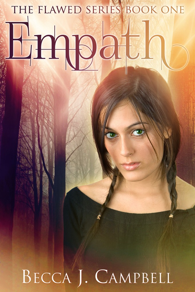
Empath
Becca J. Campbell
Supernatural empathy isn’t a gift, it’s a curse. Anywhere she goes, Jade’s emotions are replaced by those of the people around her. Jade grew up in a suburb of Colorado Springs, protected from other people by her parents. Now she faces college—and the world—with nothing to shield her from unwanted feelings. When Cam, a classmate with a major crush on her, unintentionally hijacks her emotions, Jade struggles to keep from being carried away in feelings of attraction. When Ethan, a psychopath with a thirst for fear, fixates on her, the emotional impact could be lethal. Caught in a deadly trap, Jade must untangle the emotions and find a way to use her empathic curse to overcome this killer or be overcome by him.
![]()
Empath was an enjoyable quick read for me. I zoomed right through it in an afternoon. I really loved her villain. He was extremely sinister and creepy. I might have to admit to him being my favorite character even though he’s quite despicable. If you are interested in reading Empath yourself here are some links you can follow:
Indiebound | Amazon | Goodreads
You can find out more about Becca and her books on her website and follow her on Goodreads. Now for the interview!
About Empath
How did the vampire, werewolf, and fantasy saturated market affect your process in the creation of Empath?
Honestly, it didn’t affect it. While perhaps in the vein of those types of stories, the Flawed series is quite different, and many readers have commented on the originality. I don’t read a lot of books in those genres, other than poking my nose in one now and then just to see what’s popular.
Empath was more influenced by a combination of the sci-fi movies and shows I watched at the time (Heroes, X-Men, etc.) and old-fashioned love stories like the Anne of Green Gables series. Since writing Empath, I’ve discovered more books that combine real-world situations with super powers or other special abilities. I like that trend, though I typically try to avoid all the vampire and werewolf books.
Who is your favorite character in Empath?
Ethan was the most fun to write, but Logan is probably my favorite. I have a pretty big crush on him. He’s like a combination of Edward Cullen, Wolverine, and my husband (don’t tell him I said that!), with other mysterious drool-worthy qualities thrown in for good measure.
If you had to choose to have either Jade’s empathy and Ethan’s blindness which would you pick?
I’m a visual girl and of all my senses, my vision would be the last I’d give up, but even considering that, I think I’d prefer blindness over what Jade has to deal with. I’m a pretty down-to-earth, even-tempered, laid-back girl, so dealing with even normal emotional drama wears me out. If I had Jade’s curse, I’d probably have to go hide out in a hole somewhere.
Can you give us any hints for what might be next for Jade?
Jade’s story is pretty much over, but she continues on in the rest of the series as a side character. Book #2 Outsider focuses on Josh, and Book #3 Protector is about Logan, specifically how he handles the new development of his relationship with Jade. In that way, she plays an important role in Book #3.
Will we hear more about Logan’s history in future books?
Since Book #3 is all about Logan, bits of his history trickle into the story. We will see him discover some of it for the first time. Logan has his own hurdles to overcome, and Jade is a big part in his growth as an individual–and not necessarily in the way he’d prefer.
What do you most want readers to take away from Empath?
We all have our own flaws or struggles we would like to distance ourselves from–some large and some small. Often attempting to overcome these weaknesses is a lifelong process, one that can be incredibly painful. I wrote the Flawed series to explore the biblical idea that our greatest weaknesses have a larger purpose, and if we can discover that, those challenges may even turn out to be our biggest assets in the end.
Putting It All Down
When creating and writing them, do your characters speak to you in your mind? Do you ask them questions? Do they heckle you about what you write about them? Do you know more about them than you put in the story, such as their favorite foods, family history, pet peeves, etc.?
I enjoy developing characters and I create character profile sheets for each main character, antagonist, and secondary character. But beyond that and what’s needed for the story, I don’t delve too far off course, just for the sake of time management. There are so many stories I want to write, that I try to keep focused on what’s important rather than getting bogged down in too many details.
Sometimes when scenes get cut (in Empath I cut somewhere between 30,000 and 40,000 words from first to final draft), there is a lot of minor background information that readers don’t know.
Was there ever a character in one of your books that you found very hard to write?
Early into the writing of the story, I had some trepidation about writing in Ethan’s point of view and what it would mean for me to enter the mind of a serial killer. Could I handle delving into that kind of darkness? Would it change me somehow? For a while I avoided writing Ethan’s scenes. I knew they would come into play at the end of the story, but I wanted to stick with my non-psycho characters for as long as possible. I’m not sure why I was worried. When I finally dug into Ethan’s character, he was a lot of fun to write, even with the dark brutality that makes him think so little of capturing and killing women.
It’s much easier to write this type of darkness than to read it. I think the reason for that is because as a writer, I know my creation is made up, but as a reader, stories are much more real. In that way, we writers toy with our reader’s minds, which seems a little unfair. Although, the readers get the fun of being able to enjoy a story without knowing the ending. So I guess it all evens out in the end.
Do you listen to music while you write?
I do when I need to really zone in and crank some words out. But it has to be instrumental. I prefer an interesting mixture of heavy and light, and I’ve created my own Writing Music station on Pandora. It’s derived from stuff like the Vitamin String Quartet and Apocalyptica.
What does your writing desk/area look like?
Clean, and then a little cluttered, and then messy, and then I go through a cleaning spree and it repeats. I have moods where sometimes messy doesn’t bother me and other times everything has to be organized and de-cluttered.
Long-hand, typewriter, or computer?
Computer! I’ve always been a fast typist, and I try to get words down in the quickest method possible.
What type of research did you have to do for the book, especially your villain?
I researched the differences between psychopaths and sociopaths (Ethan is a psychopath) and traits associated with the former. When I figured out his fixation with fear, I researched the various types of phobias.
Other research was mostly on locations. Some of the places like Carlsbad Caverns I’d personally visited, but I still enjoy collecting pictures and information about the places I write. I also researched the different variety of insects and animals Ethan used as pets/torture devices.
Publication Notation
What has your experience with self publishing been like?
I watched a friend do it first, so he sort of paved the way for me and was great when I had questions. Then he hit it big and sold 100,000 books in his first year. I’m still waiting to hit it big, but I’m not giving up anytime soon. I recently passed the 500-book milestone, so I’m pretty proud of that. Whether success is fast or slow, I think the key is to just keep plugging away.
How many books have you self published?
I’ve published three novels and two short stories. (My work also appears in two short-story anthologies.)
How did you choose the covers for your books?
For the Flawed series I used Steven Novak, a cover artist who had been suggested by a friend after I drooled over her book covers. Since each Flawed book focuses on a different main character, it was important to have a different person on each cover. I had the rough layout in mind and the images chosen, but he performed the magic of putting it all together. I’m extremely happy with the covers for this series.
Author Wrap Up
Favorite obscure word?
Surreptitious.
Is there a word you hate?
Silhouette. I don’t hate the word, just trying to spell it. I can’t tell you how many times it took me to get it right on the first try. I still sometimes misspell it.
Do you write in the genres you most like to read?
That’s a tricky question, because my reading varies so much. There aren’t just one or two genres I read. I’d say I write in the genres I like to watch. My favorite shows are television sci-fi dramas (Lost, Heroes, Alphas, Fringe, etc.), so I write in that arena, but with more focus on the love story angle.
What advice would you give to aspiring writers?
Write, and write a lot. Write because you love it. Write for yourself. Stick with your story(ies) and don’t give up until you get to the end–don’t you dare leave a book half-written!
Beyond that, find a support group–preferably several peers and several who are seasoned authors–and lap up their wisdom. If you want a great place to find other writers, check out JuNoWriMo.com. I’m the co-creator, and next June will be our third year with this event. A bunch of us all hang out online and write novels in June. It’s a great way to make friends and form critique groups.
I hope you enjoyed the interview as much as I enjoyed thinking up questions and talking with Becca. Don’t forget to check out Empath!
Until next time
– Joules


 Follow Me:


